No products in the basket.
Home Decor
Most Soothing Colour Schemes for Your Space

14
Jun
Jun
Choosing the right color scheme for your space can significantly impact the mood and ambiance. Soft pastel tones like pale blues, greens, and lavender are known for their calming effect. Earthy tones like browns, tans, and warm terracottas bring a comfortable feel to a room. Consider combining these Soothing Colour Schemes for a harmonious and soothing space.
Table of contents
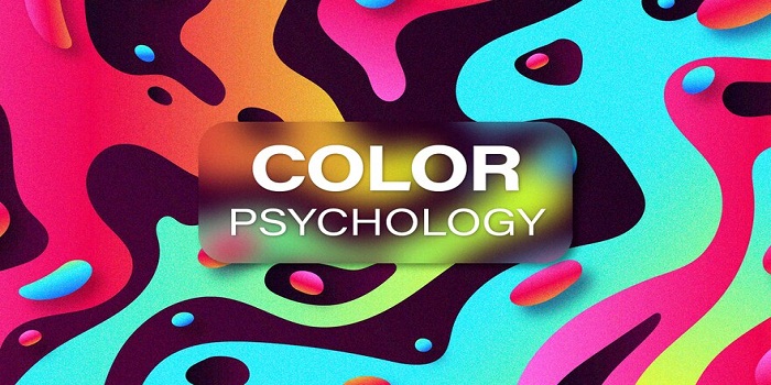
Understanding Color Psychology
Choosing an appropriate color scheme may seem an easy task. While it requires a proper understanding of the color combination and their impact on the specific settings. This article will delve into the details of selecting an appropriate color scheme.
The Impact of Colors on Mood
Colors affect how we feel. For example, some colors make us feel calm, while others can change our mood. Knowing this helps create a relaxing space. Different colors have different effects on our emotions, so choosing the right ones can make a big difference in how we feel.
Neutral Color Palettes
White and off-white hues create a sense of purity, making them ideal for small rooms or areas with limited natural light. Gray tones bring a sense of elegance while maintaining a calming effect, perfect for bedrooms and living spaces.
Harmonizing with Pastels
Soft pastel colors, including blush pink, lavender, and pale yellow, bring a touch of subtle elegance. And charm, enhancing the overall peacefulness of your space.

| Point | Explanation |
| 1. Soft Pastel Colors | Soft pastel colors like blush pink, lavender, and pale yellow are characterized by their light tones and gentle hues, creating a calming and soothing ambiance in any space. |
| 2. Subtle Elegance | These pastel shades add a touch of subtle elegance to your surroundings, imparting a sense of sophistication and refinement without being overpowering or too bold. |
| 3. Charm and Warmth | Pastel colors bring a charming and warm atmosphere to your space, making it feel inviting and cozy. Their gentle tones help in creating a welcoming environment that promotes relaxation and comfort. |
| 4. Enhancing Peacefulness | Incorporating pastel colors such as blush pink, lavender, and pale yellow enhances the overall peacefulness of your space, making it a tranquil retreat where you can unwind and destress after a long day. |
| 5. Versatile and Appealing Decor | Pastel hues are incredibly versatile and can be easily incorporated into various decor styles, from modern to traditional, adding a touch of beauty and appeal to your interiors. Their softness complements other colors and textures, creating a harmonious look. |
Earthy Tones for Natural Comfort
Beige and taupe colors offer a warm and cozy atmosphere, reminiscent of natural elements like sand and wood, ideal for creating a welcoming vibe. Green shades, from soft pastels to deep emeralds, connect us with nature, promoting relaxation and harmony, making them suitable for any room in the house.
Calming Blues For Soothing Colour Schemes
Soft blue hues, such as sky blue or powder blue, create a serene and tranquil ambiance, perfect for bedrooms and relaxation areas. Deep blue shades, like navy or indigo, add depth and sophistication while instilling a sense of calmness. Making them a great choice for accent walls or decor elements.
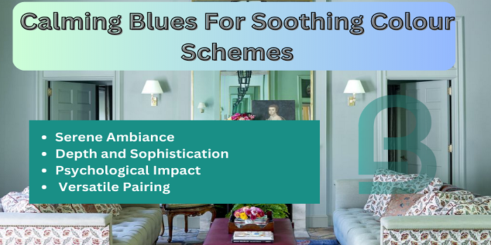
1. Serene Ambiance | Soft blue hues like sky blue or powder blue evoke a sense of calmness and tranquility, ideal for spaces where relaxation is key, such as bedrooms or meditation areas. They create a soothing atmosphere that promotes rest and relaxation.
2. Depth and Sophistication | Deep blue shades such as navy or indigo add depth and a touch of sophistication to a room’s decor. These darker blues can create a sense of coziness and intimacy, making them perfect for accent walls or as focal points in a space.
3. Psychological Impact | Blue is known to have a calming effect on the mind and body, promoting feelings of peace and reducing stress levels. This makes it a popular choice for spaces where relaxation and unwinding are priorities.
4. Versatile Pairing | Blue hues are highly versatile and can be paired with a wide range of colors and decor styles. They complement neutrals like white and beige beautifully, as well as contrast with warmer tones like mustard yellow or coral for a vibrant yet balanced look.
Conclusion
Choosing a soothing color scheme involves understanding color psychology and selecting hues that resonate with your desired atmosphere. Whether you prefer neutral tones, earthy hues, calming blues, or soft pastels, creating a tranquil space is achievable through thoughtful color choices.
Read More Most Soothing Colour Schemes for Your Space
FAQs
Which color is best for promoting relaxation?
Soft blues and greens are excellent choices for promoting relaxation and tranquility.
Can I mix different color schemes in one room?
Yes, combining complementary colors can create a harmonious and balanced look in your space.
Are dark colors suitable for small rooms?
Colors can add depth and coziness to small rooms but should be balanced with lighter elements to avoid feeling too enclosed.
How can I test paint colors before committing?
Many paint brands offer sample pots that allow you to test colors on your walls before making a final decision.